Why Established Brands Change their Logo
Updated 15 January 2020 (Published 15 December 2015) by Miles in Business Tips
The logo represents the ideologies and values of a company and people connect more with the logo of the business rather than the services or products it offers.

We can always rely on the logo.
No matter what happens in life, we know that Nike will always be confirmed with a tick, Google will always be that weird child-like colour combination and Coca-Cola will always be Coca-Cola.
So when an established company decides to re-brand, the end result is often met with an angry mob exclaiming "rabble!rabble!rabble!" and pleads to change it back, as if somehow the madness will end, and their lives will return to normalcy.
Why do established brands wade into the murky waters of the unknown and risk it all for a snazzier looking logo?
Here, I rank the reasons from desperate to sensible, because this seems like an appropriate grading system.
To Pique Public Interest
What better way to generate publicity than to take a much-loved logo and turn it on its head, just to get people talking? Pepsi has done this quite well and I believe they're up for a redo yesterday. In comparison to their rival, Coca Cola, Pepsi's logo has continuously evolved.
To Remain Relevant
Google Logo Watch 2015 has delivered to us the same great taste but a slightly different flavour. Originally a block font and then a serif as pictured, Google recently updated their logo to a modern sans-serif and kid-friendly rounded font.
To Signal an Expansion in their Range
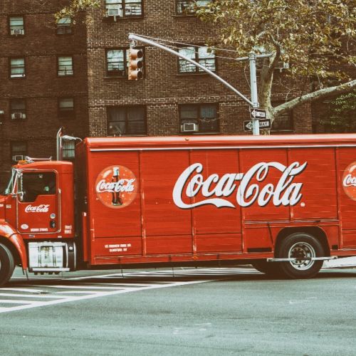
In the 80s, the USA division of Coca Cola not only decided to change their beloved product but also their logo to simply read "Coke". After a public uproar of the aforementioned "rabble!rabble!rabble!", Coca Cola changed their logo back. Over time it has slightly evolved but never straying from the original script font that has become one of the most famous logos.
Differentiation from Competitors
If you're a frequent Euro-traveller like I am, you would have seen the recognisable Deutsche Bank logo around. As part of rebranding and to stand apart from their competitors, they updated their logo to draw focus on the imagery.
To Disassociate Itself from Negative Press or Connotations
Kentucky Fried Chicken changed their name and logo to simply read KFC due to health concerns surrounding fried food. Luckily for KFC, the public were already calling it just that, so it was a seamless transition.
Due to a Merger
Kraft Foods Group and H.J Heinz Company merged in 2015 and essentially merged their logos together without changing too much of the design.
Summary
Rebranding a logo is never an easy task, particularly if the company is well-established and trusted. By the time the next logo revision comes around, the angry mob have often forgotten about those that came before.


