How Microcopy Can Dramatically Improve User Experience
Updated 31 May 2021 (Published 4 April 2019) by Miles in Website design & UX
We interact with websites and software every day. Some interactions are great, others are less so. Let’s look at Microcopy and what it is, and how it can be used to make the user experience so much better.

When crafting a new website or web application, such as a SaaS product or an ecommerce shop, it is easy to get stuck thinking about layout, colours and overall ‘feel’. Whilst a user finds these very important of course, it is often the ‘polish’in the smaller elements, such as microcopy that can make all the difference.
What is Microcopy?
You may not have heard the phrase, however Microcopy is all around us, and you are likely to read plenty of it each day.
Microcopy is the term we use for the small sentences and phrases which help guide a user through a process, or help encourage them to reach a goal.
For example, ‘Join our newsletter’ or ‘Request a quote’ are both examples of microcopy.
What makes great Microcopy?
If you have been tasked with the job of writing microcopy, you should ensure that;
Uses plain language
Imagine completing a form, and seeing a message ‘Warning user omission has caused inaccuracy’ – this would give any person a headache, right? Something like ‘Please complete first name’ is succinct and clear on the next steps.
Shows personality
You should show empathy with errors, or congratulate with success. Remember, your users are real humans and not transaction numbers. Screaming ERROR! At a person encourages them to leave, rather than complete the task.
Is contextual
If a user interacts with a form or a feature, tell them what success or error they have, don’t just display the same text over and over. Many examples of effective microcopy are often hidden until an action is done (or an error appears).
Concise
You should work hard to keep your microcopy as succinct and to the point. Try reading it aloud – does it sound like a long ramble? Edit it again.
For example, you could replace
Having trouble completing this form? If you experience a problem, you can call us on (08) 9228 2233 or email us via bam@bam.com.au
With something far more succinct, such as;
Having trouble? Please get in touch.
Right tone
The microcopy you use should show the same tone and personality as the rest of your website or web application. Don’t be all casual or too formal, if that’s not your usual style.
Great Microcopy examples
Let’s look at a number of examples of great microcopy, and explain why they are effective.
Sign up form
The Pipedrive sign up form works for a number of reasons;
- Explains clearly when you will get access ‘Immediate access’
- Answers a popular concern ‘No credit card needed’
- Yes an actionable button with clarity on cost ‘Try it free’
Then, for bonus points, they have a good error message when something goes wrong. They use human and simple language to clarify what went wrong with submitting the form, ‘Please add a valid email address’.
Download form
The modal popup on the Australian Mining website to download a white paper ticks all the boxes. The main winners here, are;
- Form field prompts are simple to follow and use active language
- Submit button text is positive and shows value ‘Know more’
- Answers concern about information security ‘We do not sell or share your information with anyone’
Call to action (CTA)
Snapchat spend a metric truckload on marketing, so if anyone should get it right, it’s them. This full width call to action (CTA) to download their snap kit has a wonderful, bold intro.
Software sign-up
Twitter has a sign up form that immediately sells the benefit of Twitter ‘See what’s happening in the world right now’.
Search form microcopy
This search box on the Unsplash website does a good job of explaining;
- The photos are free
- They are in high resolution
- You’ll search for photos with this search box
Just in case you still aren’t convinced, they have links to a few trending searches directly below, so you can see the typical format of a search, or just kick start your searching efforts by clicking one of them.
Multi field sign up form
The start of this signup form for 6Q is clear. First the headline states you’ll get started with a free account, allying fears of being charged immediately.
They then follow up to clarify three common concerns;
- No obligation – this doesn’t need to mean any commitment
- No credit card expected – so no sneaky ‘we’ll start charging in 21 days’
- No software or downloads needed – so no concern about viruses or getting IT approval.
Add to ecommerce cart
This ecommerce form is good – the button changes from the default ‘Add to cart’ before you click, to ‘Adding’ for a few seconds when you click, and then finally ‘Added’, all stating the progress of your order in under three words.
Software interaction
Inside the Asana software, the small screen real estate here shows two very helpful examples of microcopy. First is the search field which clearly states what you’ll be searching in.
Then a simple text link lower down, ‘See all tasks’ which appears next to todays task headline.
404 error message
We’ve all been there – the dreaded 404 error. There are two main ways of dealing with these.
In this example from Buffer, they show a fun personality (the monkey emoji and Whoops! Headline) and then follow up with some empathy, ‘we’re sorry about that’.
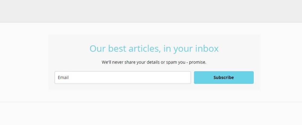
Simple form field
The above example from the Australian Software Guide is great for two reasons;
- They clearly state what the promise is 'Our best articles, in your inbox’
- They show a prompt with 'Email' inside the form field
A few poor microcopy examples
Let’s look at a few examples of bad microcopy, and explain how they could be improved easily.
404 Page
One of Australia’s biggest banks has the worst 404 error. Not only is it absolutely devoid of any personality, the long text explaining why it may be a 404 is only shadowed by the metres long site map shown underneath (which I’ll avid punishing you with).
Very long form
This is a form for updating a business listing on a directory. Instead of giving any instruction, when you click ‘Edit my listing’ you jump straight to this form.
There are a few fields with asterisk symbols. I assume this means these fields are required, however it isn’t stated anywhere.
I can imagine some people complete the entire form again (there are at least another 15 fields beyond this screen grab) just to update 1 or 2 fields.
This could easily be rectified by having text at the top, which explains the fields you must complete, and gives an indication of what will happen next.
For example;
‘Only complete the fields you need to update. Fields marked * are required. We will send an email response when you have submitted this form, and then inform you of progress within 24 hours’
Login error
I intentionally did not complete this sign in form correctly. The screen refreshed, and seemingly nothing happened.
After two or three attempts, I realised at the very top of the screen is an error message, which only stays for a few seconds before fading away.
This would be far better placed within the form itself (see Pipedrive example above) and to remain there until the form is resubmitted.
Note: Logo and site description intentionally blurred, to not point at a specific brand.
Newsletter form
Here’s a typical email newsletter subscribe form. However, I’m still full of questions they could have answered;
- What will the content be?
- How frequent are their emails?
- Will you share my email address?
Worst still, is the submit button states ‘Submit a newsletter’ – what does this mean? Do I need to write them one? What am I meant to submit? It also doesn’t help the button doesn’t look like a button, but rather a plain text link.
A better succinct description would be;
Receive our monthly email, full of advice for Australian small business owners.
(Then have the email address form, with a clever button like Ýes please!)
Your email is safe with us; we never share nor spam. You can unsubscribe instantly at any time.
Ecommerce message
Whilst the intention is good with this large Australian ecommerce site, a few issues are still apparent;
- The microcopy is in a popup window (I often have popups blocked)
- The ‘Add to Bag’ button still says ‘Add to Bag’ – did it work?
- What have I added? ‘This item’?
They could have stated ‘Success! You’ve added this Parkway jacket to your bag’ just as easily.
Your homework for today
Look through your website or web application, and find all the examples of microcopy – does it meet the ‘great microcopy guidelines’ above, or does it need further crafting?
Don’t forget to test your 404 page, by appending a random string of words at end of your website address (www.example.com/whatwillhappenwhenigotothisnonexistingpage)
Intentionally do things wrong within any application, so you can see what happens. This can sometimes be tricky to find – maybe ask a colleague to do this, if you feel you are too close to the system.
Continue to find other examples of great microcopy, and take inspiration from them.
Read more on microcopy. I have included a handful of articles to continue your reading, below.
More microcopy reading
Here’s a few other articles that you may find worth reading on this topic.
Microcopy: Tiny Words With A Huge UX Impact
5 Ways To Prevent Bad Microcopy
The invisible pieces of microcopy you’re forgetting
In Summary
Now that you’re full bottle on microcopy, you should complete the homework above, and then continue to learn from others.
Well-written microcopy will guide users, and poorly written microcopy will confuse and frustrate them. Spend a little extra time to ensure that every small message within your website or web application has the right phrasing and is clear to users, and you’re on your way to better things.
Related Articles